

⚡ Join us for the Silver Jubilee episode of our LinkedIn talk show. ⚡
Book a Demo

Application and Website Usage

Understand exactly how apps and websites are used during work hours. Identify time drains, optimize tool usage, and boost productivity across every team.
.png)
View top apps, URLs, and total time spent—categorized for quick insights
The Overview tab shows where time goes across all apps and websites your teams use. It highlights the most used apps and URLs, total hours logged across tools, and breaks them down by productivity categories like communication, development, social media, and more. Managers can quickly see if the bulk of work time is going into tools that drive results—or into distractions. It’s the ideal starting point for spotting trends without diving too deep.Get a clean, high-level view of who’s available, which tools are being used, and where engagement is happening across the organization. Ideal for staying informed and aligned, without diving into complicated dashboards or spreadsheets.
Know which tool categories are eating up work hours—productive or not
This section summarizes time spent across tool categories like “In-House Tools,” “Meetings,” “Browsing,” or “Entertainment.” You’ll instantly see where most of the workday is going. If too much time is spent on passive tools or non-work categories, this insight helps course correct. For productivity-focused teams, it helps validate whether tools like Slack, Zoom, or Jira are being used as intended—or just open in the background.See a dynamic, up-to-the-minute feed of team presence, current tools in use, and active time blocks. Perfect for managers needing real-time awareness to guide decisions, align teams, or offer support when it’s needed most.
Click into any app or website to see who used it and for how long
Go from overview to granular with a click. This tab lets you zoom into specific applications or URLs to see which employees accessed them, and how much time each person spent. Whether it’s monitoring use of internal platforms or spotting time drains like YouTube or WhatsApp, this view gives full transparency into digital behavior. Perfect for compliance checks or fine-tuning your team’s tech stack.
Get per-user reports for every app and URL to uncover individual usage habits.
This feature shows employee-level usage for every app and website. It’s perfect for understanding individual work patterns—like who is spending too much time on one tool, or who is multitasking across too many platforms. For managers, it adds clarity to coaching conversations. For HR and IT, it offers behavioral insights tied directly to digital workflows—supporting smarter policies, training, or access controls.

No matter what kind of home you have to share, you can increase your earnings.

No matter what kind of home you have to share, you can increase your earnings.

No matter what kind of home you have to share, you can increase your earnings.
Perfect for senior managers, HR leaders, and team heads who want proactive AI-driven insights instead of manual data crunching.

Delivers clear, contextual recommendations—not generic suggestions.
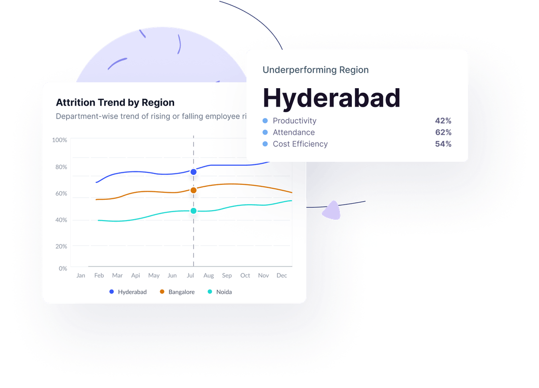
Scans all teams daily for immediate detection of critical issues.
Guidance tailored to each team’s specific trends and risk factors.
Helps reduce churn with early warnings on disengagement.
Ensures privacy and security with encrypted data, secure connections, and multi-standard compliance

Demonstrating our commitment to security, availability, processing integrity, confidentiality, and privacy.

Ensuring compliance with European Union data protection and privacy regulations.

Certified adherence to international standards for information security management.

Demonstrating our commitment to health data privacy, security, and HIPAA compliance.