

⚡ Join us for the Silver Jubilee episode of our LinkedIn talk show. ⚡
Book a Demo

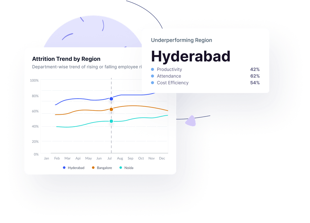
Technology Usage

Unlock powerful insights into software usage across departments and teams. From adoption rates and daily active users to productive vs. unproductive tools, this feature helps you drive better licensing decisions, improve focus, and boost your tech ROI
Understand Usage, Boost Efficiency
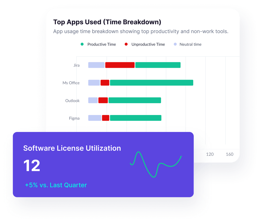
Get a department-wise breakdown of tool usage—highlighting which teams are leveraging their software effectively and where productivity drops due to low engagement or distractions. Easily distinguish between work-related apps and non-work tools. These insights help you reallocate software resources, plan training, and support your teams to work smarter with the right tech stack.
Minimize Risk, Maximize ROI
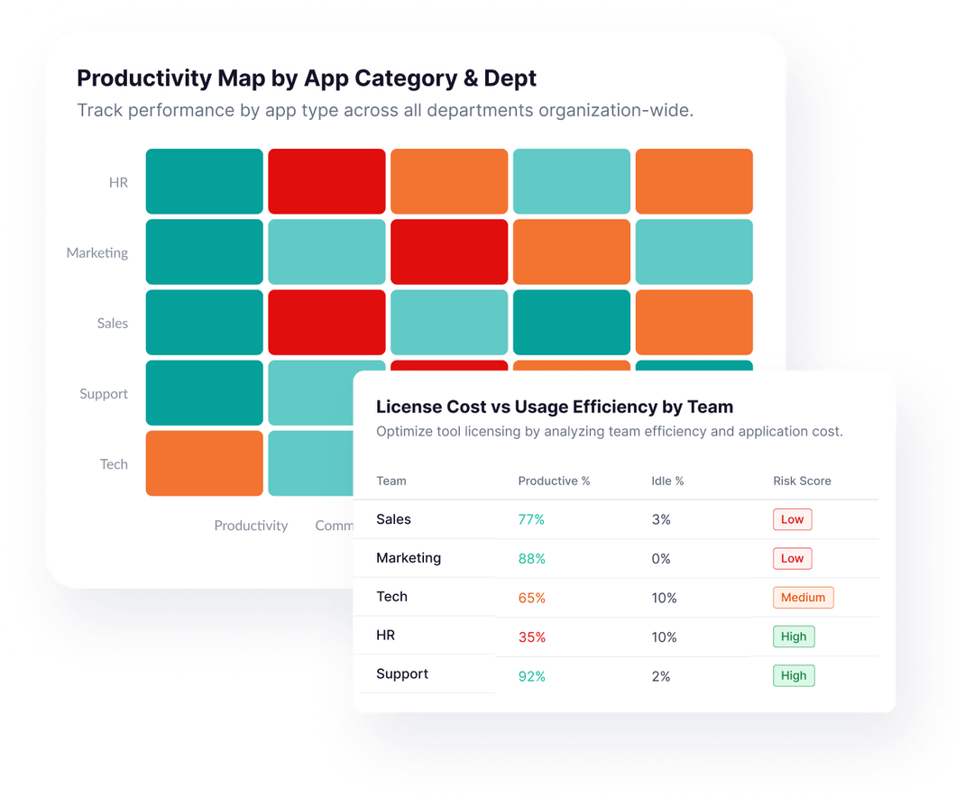
Detect risky, non-compliant, or distracting applications in real-time. This tab identifies software that could be eating up time or threatening data security. It also compares usage levels with software cost—flagging underused tools so you can eliminate waste and focus spend on high-performing apps. Build a more cost-effective and secure digital environment, powered by data.
Slash Waste, Reclaim Value
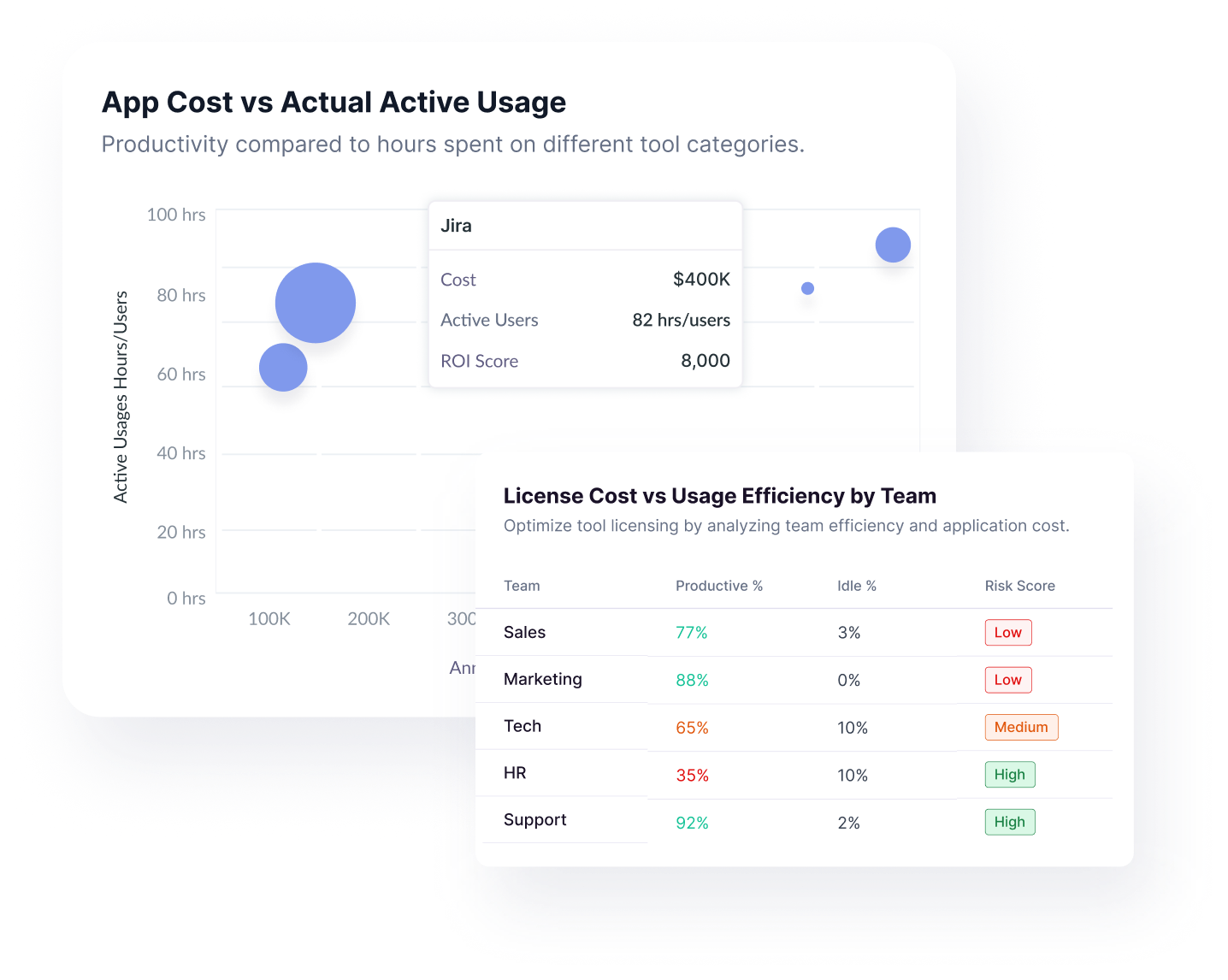
Analyze software spend vs. actual usage across all departments. Identify overlapping tools, inactive licenses, or subscriptions that aren’t delivering value. Organizations waste up to 38% of their software budget—this tab helps you take it back. Reinforce investments in tools that actually drive work, and remove those that don’t.
Track What Boosts Output—And What Drains It
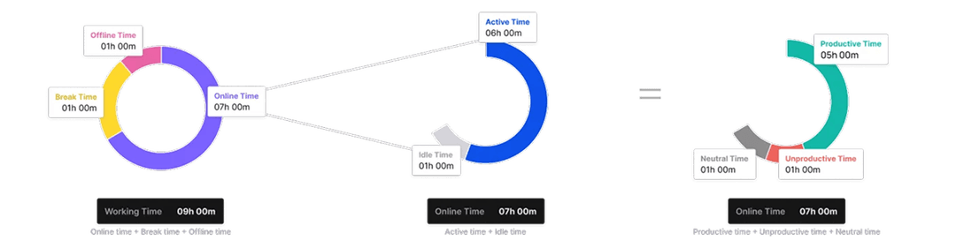
Monitor usage of unproductive tools like social media or streaming platforms. See how tool focus correlates with team efficiency and spot patterns—like spikes in distraction before deadlines. Even passive monitoring increases employee awareness and focus, with some teams showing a 39% improvement in output post-visibility.

No matter what kind of home you have to share, you can increase your earnings.

No matter what kind of home you have to share, you can increase your earnings.

No matter what kind of home you have to share, you can increase your earnings.
Perfect for senior managers, HR leaders, and team heads who want proactive AI-driven insights instead of manual data crunching.


Delivers clear, contextual recommendations—not generic suggestions.
Scans all teams daily for immediate detection of critical issues.
Guidance tailored to each team’s specific trends and risk factors.
Helps reduce churn with early warnings on disengagement.
Ensures privacy and security with encrypted data, secure connections, and multi-standard compliance

Demonstrating our commitment to security, availability, processing integrity, confidentiality, and privacy.

Ensuring compliance with European Union data protection and privacy regulations.

Certified adherence to international standards for information security management.

Demonstrating our commitment to health data privacy, security, and HIPAA compliance.