

⚡ Join us for the Silver Jubilee episode of our LinkedIn talk show. ⚡
Book a Demo
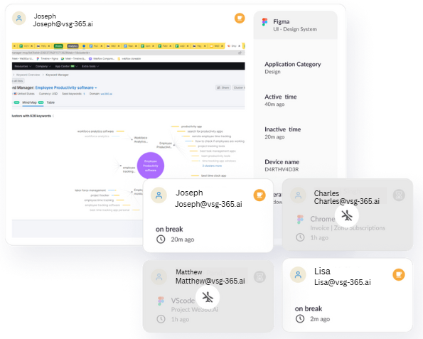
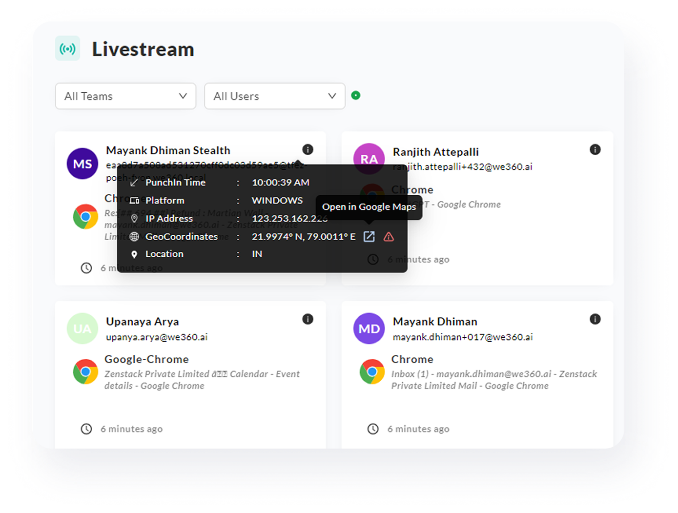
Livestream

Watch work happen as it happens. Live Stream gives you a real-time view of team activity—who’s online, when they’re active, and how engaged they are throughout the day. It’s a powerful way to stay informed without micromanaging, especially for hybrid and distributed teams.
.png)
Know what’s happening—right now, across your teams
Get a clean, high-level view of who’s available, which tools are being used, and where engagement is happening across the organization. Ideal for staying informed and aligned, without diving into complicated dashboards or spreadsheets.

Instant visibility, zero digging
See a dynamic, up-to-the-minute feed of team presence, current tools in use, and active time blocks. Perfect for managers needing real-time awareness to guide decisions, align teams, or offer support when it’s needed most.
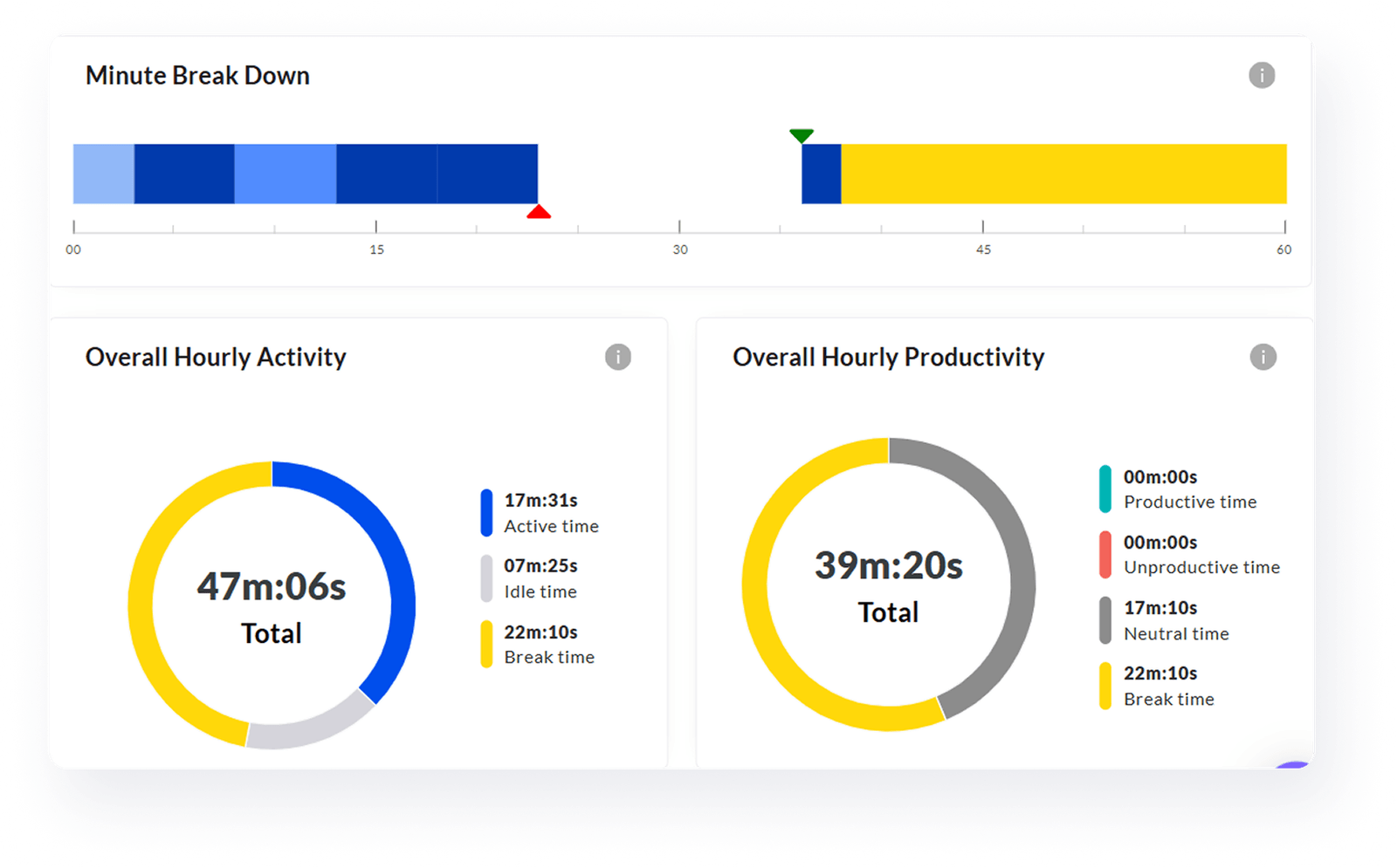
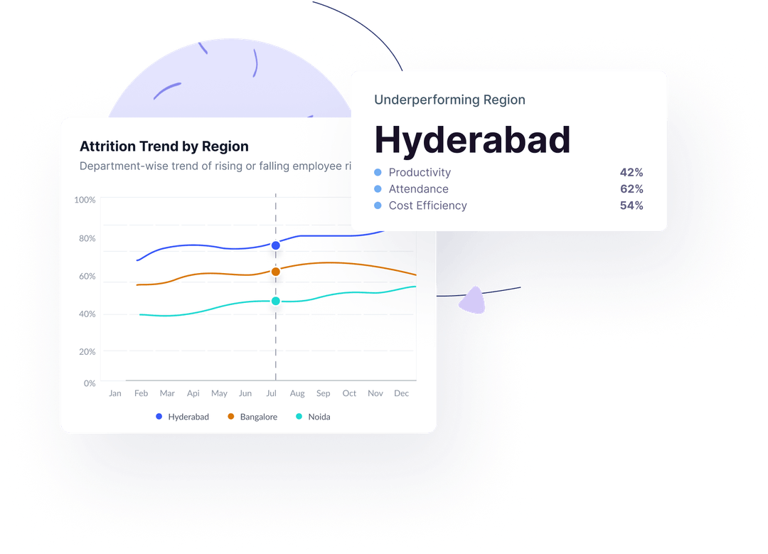
See the rhythm of work—logins, logouts, and everything in between
Gain clarity on daily presence patterns—when employees come online, take breaks, or wrap up. Identify irregularities or signs of overload and make smarter decisions around syncing, collaboration, or workload balancing.
From quick overviews to deep dives—your data, your way
Explore presence and engagement trends over days, weeks, or months. Compare teams, detect drop-off patterns, and spot performance rhythms. Designed to help you transform daily visibility into long-term insights that drive better planning.

No matter what kind of home you have to share, you can increase your earnings.

No matter what kind of home you have to share, you can increase your earnings.

No matter what kind of home you have to share, you can increase your earnings.
Perfect for senior managers, HR leaders, and team heads who want proactive AI-driven insights instead of manual data crunching.

Delivers clear, contextual recommendations—not generic suggestions.
Scans all teams daily for immediate detection of critical issues.
Guidance tailored to each team’s specific trends and risk factors.
Helps reduce churn with early warnings on disengagement.
Ensures privacy and security with encrypted data, secure connections, and multi-standard compliance

Demonstrating our commitment to security, availability, processing integrity, confidentiality, and privacy.

Ensuring compliance with European Union data protection and privacy regulations.

Certified adherence to international standards for information security management.

Demonstrating our commitment to health data privacy, security, and HIPAA compliance.