

⚡ Join us for the Silver Jubilee episode of our LinkedIn talk show. ⚡
Book a Demo

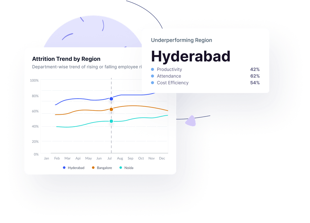
Location Performance

Track how every region is contributing to performance, cost, and productivity.
.png)
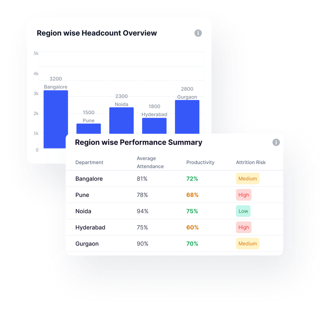
Compare performance, cost, and headcount across locations with one simple, real-time view.
This section provides a high-level summary of how each office location is performing. Metrics like average attendance, productivity, cost per user, and attrition risk are shown side by side—making it easy to spot which regions are excelling and which need attention. You can also view headcount distribution and identify areas that may be overstaffed or underutilized. It's ideal for multi-location teams looking to track operational efficiency at a glance and align business decisions with regional performance.
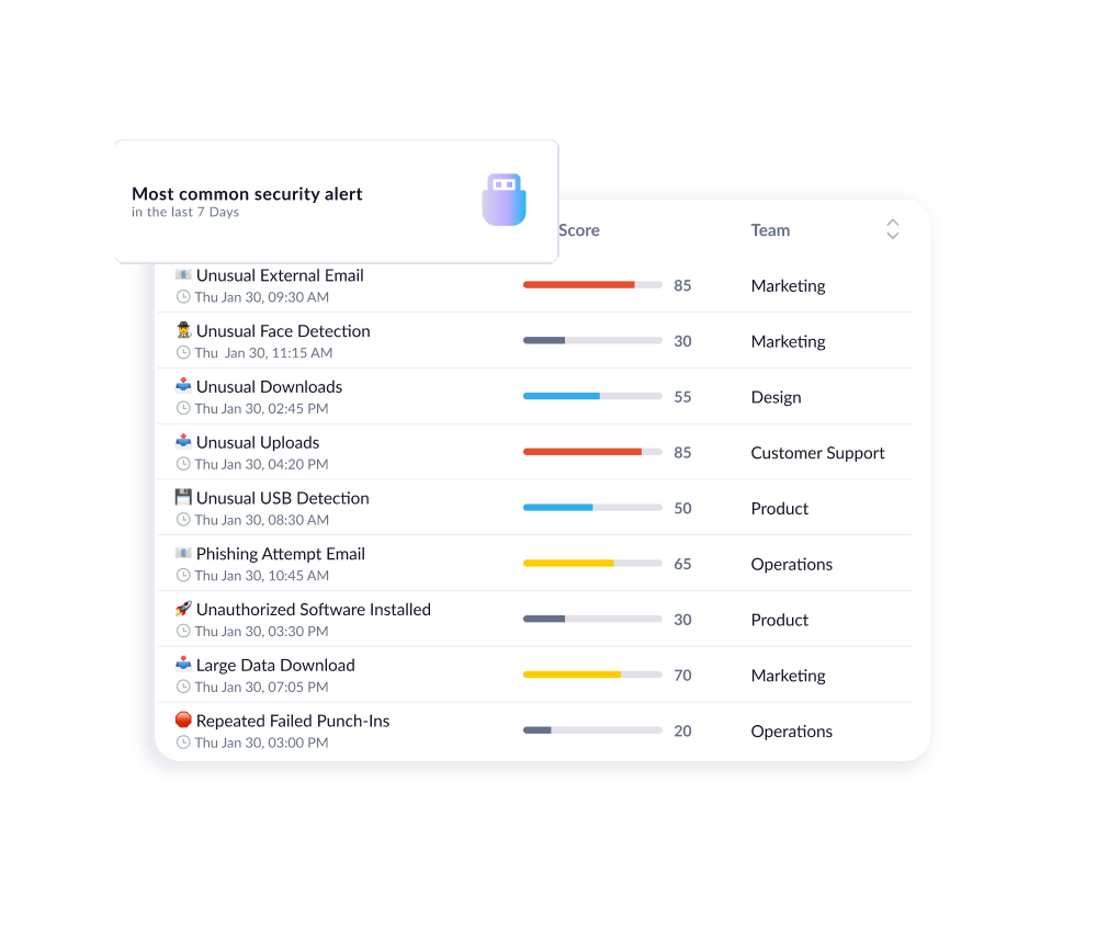
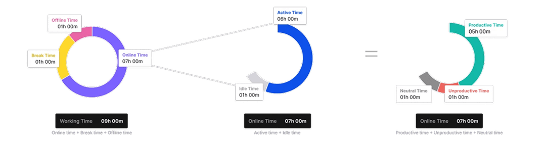
Track attendance patterns, absenteeism, and punctuality by region to manage team discipline and availability.
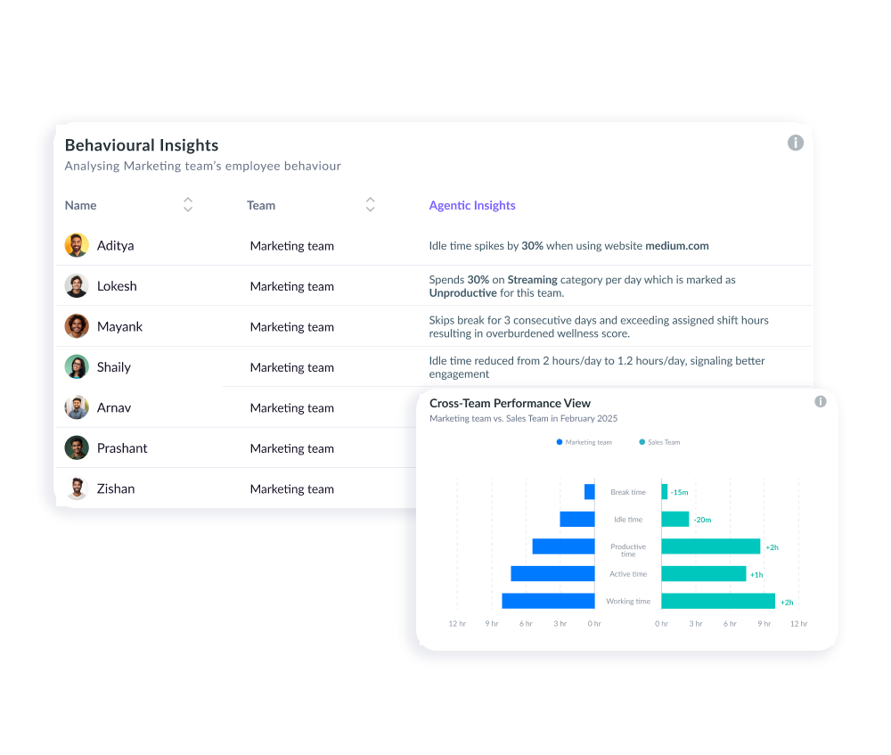
This tab provides a team-wise analysis of activity patterns, break averages, productive/unproductive time, and variability risk levels. Agentic AI highlights unusual swings in engagement, helping managers address root causes—like excessive neutral time or uneven work habits—before they impact results. Clear recommendations accompany each insight to guide improvement.
Analyze productive and unproductive tool usage across regions to improve focus and software ROI.
This section tracks the software and applications used by employees in each region, categorizing them as productive or unproductive. Apps like Jira, Outlook, and Teams reflect focused work, while tools like YouTube or Spotify indicate distractions. The feature helps identify what tools are actually used during work hours and highlights regional differences in software engagement. It’s a great way to uncover misuse of licensed tools or detect patterns that lead to lower productivity—enabling smarter decisions on tech spend and employee training.
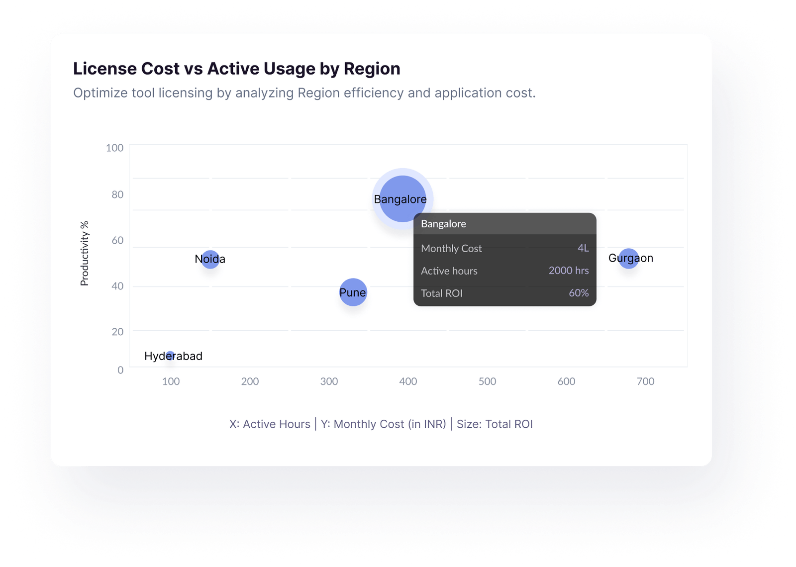
Match tool usage to licensing cost and assess overall ROI by team and region.
This tab shows two important visualizations:
License Cost vs Active Usage by Region – This graph plots monthly software cost against the total active hours logged, revealing whether each region is making good use of the tools they’re paying for. A high cost with low usage indicates wasted spend.
License Cost vs Usage Efficiency by Department – This chart compares software investment with team output, helping you identify departments that are overpaying for underused apps or tools.

No matter what kind of home you have to share, you can increase your earnings.

No matter what kind of home you have to share, you can increase your earnings.

No matter what kind of home you have to share, you can increase your earnings.
Perfect for senior managers, HR leaders, and team heads who want proactive AI-driven insights instead of manual data crunching.


Delivers clear, contextual recommendations—not generic suggestions.
Scans all teams daily for immediate detection of critical issues.
Guidance tailored to each team’s specific trends and risk factors.
Helps reduce churn with early warnings on disengagement.
Ensures privacy and security with encrypted data, secure connections, and multi-standard compliance

Demonstrating our commitment to security, availability, processing integrity, confidentiality, and privacy.

Ensuring compliance with European Union data protection and privacy regulations.

Certified adherence to international standards for information security management.

Demonstrating our commitment to health data privacy, security, and HIPAA compliance.